Pot & Bloom
Packaging Design
Iconography, Brand Architecture System, Product Portfolio Design
Pot & Bloom is a B2C home gardening brand launched by Cropnosys, a company with extensive, science-backed expertise in large-scale farming. This initiative aimed to leverage their knowledge to enter a new market by offering an innovative and approachable home gardening solution. The brand primarily targets urban SEC-A individuals aged 20–40 who are interested in maintaining home gardens while also appealing to children, making gardening a fun family activity. My contributions included designing iconography to enhance usability, developing a brand architecture system for clear product differentiation, curating the product portfolio to ensure coherence and functionality, and collaborating on experience touchpoints to create an engaging and seamless gardening process.
The project is now live. Here’s the link to the store website: Potandbloom.com
Credits
Design Agency : Therefore Design
Design Associate : Rohit Gaikwad
Photography : Pot & Bloom Team
Creative Director : Gauri Barve Kale
Artworking : Akshay & Chetan
Project Manager : Ketan Joshi
Design Associate : Vaishnavi Ladkat

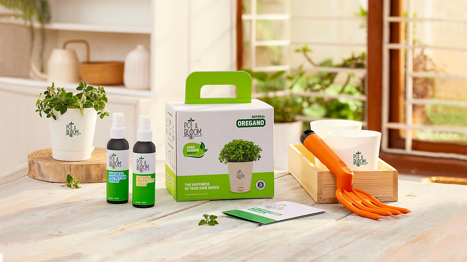
STRATEGIC INTERVENTION
The kit was meant to be a collective, fun activity for kids and parents. This necessitated that the entire packaging was based on functionality and simplicity. The visual language design smartly took inspiration from the identity and gave the packs a natural and organic appeal.
We created an engaging, illustrative representation of what your kit contains. Simple, intuitive and easy step-by-step instructions manuals to grow your plants were also designed to make the process enjoyable and informative for the audience.
Designed to look like a beautiful gift box, the kit brought out an aspirational gifting aspect.


PACK ARCHITECTURE
The product portfolio was divided into 3 ranges – floral, veggies and herbs. This differentiation was simplified by an easy colour-based brand architecture which also ensured that they stand out on shelves. In the herb range, the health and culinary benefits of the products were mentioned on the SOP to help the consumer make an informed purchase decision.
The overall feel of the packaging was vibrant and evoked a cheery feeling. The font Ropa was chosen as it is clean and minimal, thus offering good legibility along with being fun and approachable.

ICONOGRAPHY
The design had a ‘Backed by Science’ lockup which clearly conveyed that we have taken care of all the groundwork for the consumers and that they could be assured that their plants would flourish. It also helped in building the trust and credibility factor and proved to be a strong differentiator amongst the competition.